
I had the privilege of working at Ad Hoc, self-described as a digital services company that was ‘born out of the rescue of HealthCare.gov’. They ‘help the federal government better serve people. They do this by hiring technologists across the country to build human centered solutions, often in the form of modern software.
My Role:
As a UX consultant, I was placed on a small, balanced team working with the V.A. (U.S. Department of Veteran Affairs). Our team focused on all aspects of V.A. facilities, e.g. new location webpages, ‘find a location’ type features, and increasingly the intersection between physical locations and health services taxonomy, with the ultimate goal being to help connect Veterans to health facilities and services. While at Ad Hoc, my role fluctuated but required about 75% research and 25% design. I dove into the deep end as I learned to facilitate delicate interviews with Veterans of all stripes and colors, some who had experienced PTSD, military sexual trauma and even those who use assistive technology to navigate their world. I was responsible for prototyping and user testing design solutions based on research findings as well as delivering final designs.
Contributing to the Design System
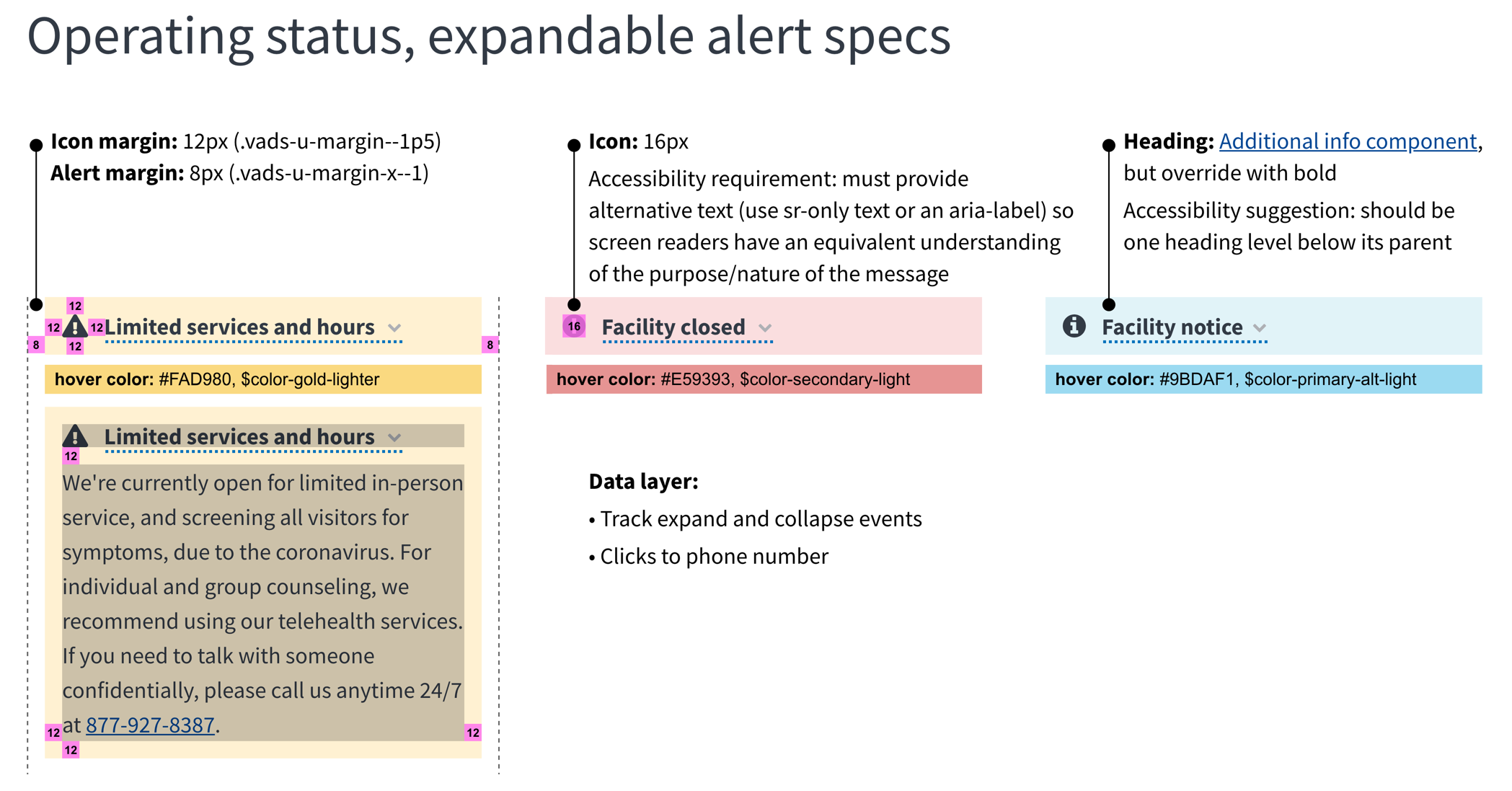
VA.gov uses alert notifications to inform users of both VA-wide and location specific information that can be hard to reach a Veteran. The existing alert was fixed, large and lacked variations to meet some common use cases. The Vet Center project necessitated the creation of a mobile-friendly, minimized version that could also contain extra information for situations that lacked destination pages. After consulting with other VA product teams, I learned that these were adaptations that other designers also wanted to leverage. I met with other teams to understand their needs in creating the expandable alert. It is in the process of being adopted by the design system. Other teams have since used, tested and evolved the component.
UX Design & Research: Vet Centers
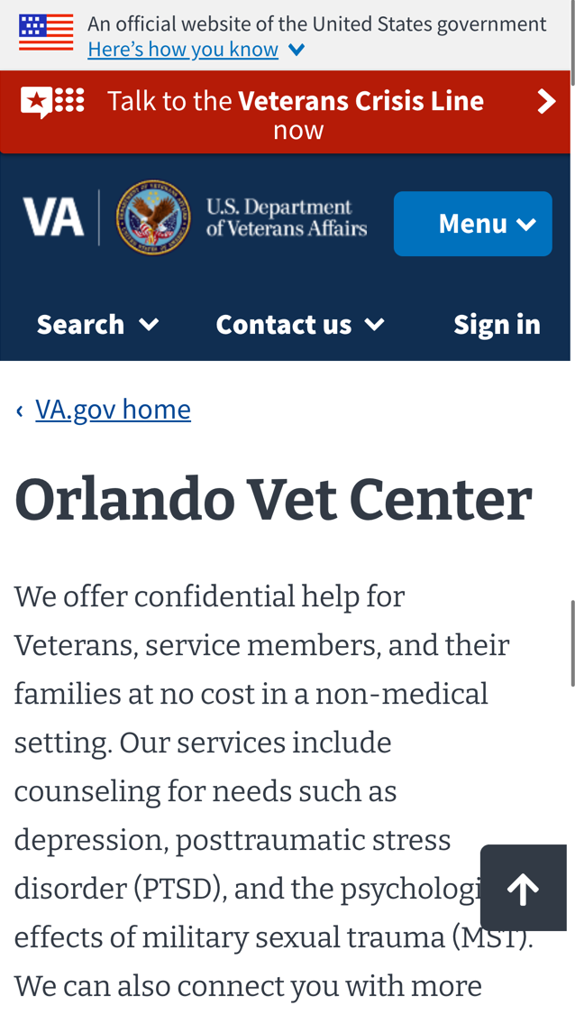
A good deal of my time at Ad Hoc was spent researching and designing a new facility website for Vet Centers. Vet Centers are stand-alone places where Veterans can receive mental health care and get connected to other wrap around services in a non-medical setting. I conducted 5 research studies by the time we were ready to launch the MVP. Working mostly within the confines of a mostly established template, our findings led us to focus on the power of language. By using accurate and reflective language on the website to describe the distinctive type of care Vet Centers provide, we could better connect Veterans with the unique kinds of services and care that they were seeking when searching on Google or VA.gov.
Project highlights:
- Qualitative interviews with Vet Center counselors and learning about their work.
- Trauma-informed qualitative interviews with Vet Center clients, who had experienced PTSD, military sexual trauma and other military related issues.
- Advocating for Veterans upon learning of their negative associations with VA medical facilities.
- Taxonomy research to make sure the website mirrored the language and benefits that Veterans appreciated most about Vet Centers.
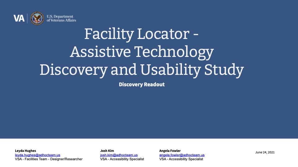
Assistive Technology Discovery & Usability Study
Our team was eager to understand how our products fared when used with assistive technology. With plenty of assistance from Ad Hoc’s two resident assistive technology experts, I led a study that shed light on the matter (see research readout PDF). It was painful to watch the users struggle, especially because many of the research participants were blind or had low vision. Any issue that could be annoying to a sighted user would be a complete deal-breaker for blind or low vision people.
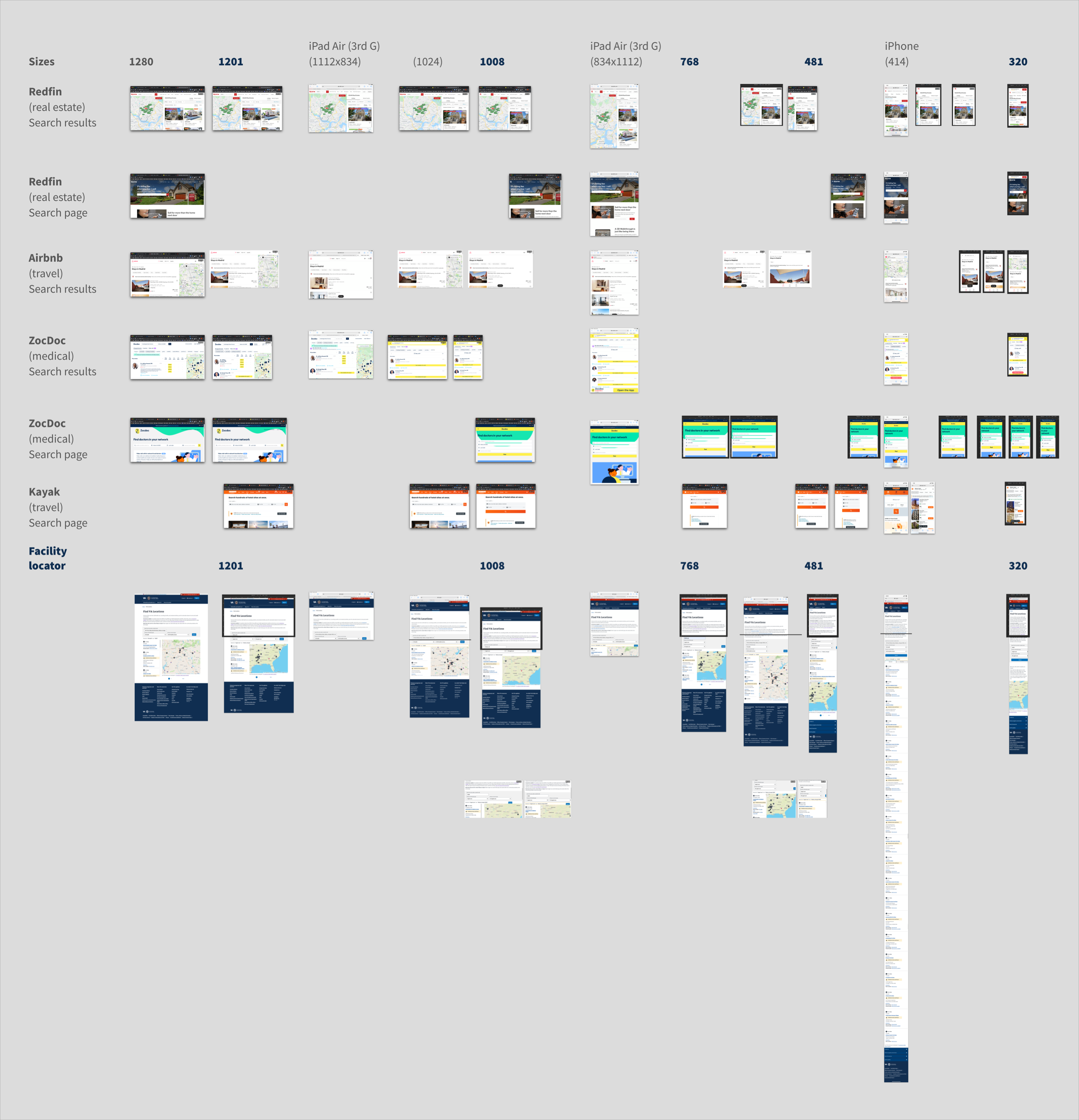
Breakpoint Analysis
Upon joining the facilities team, I decided to take stock of where the product stood. I took screengrabs of the our main product, the facility locator page, and captured how the page looked and behaved at the breakpoints that the VA styleguide specified. I also did a light comparative analysis of other products that offered similar functionality but were doing a better job of delivering functionality at the different breakpoints.