
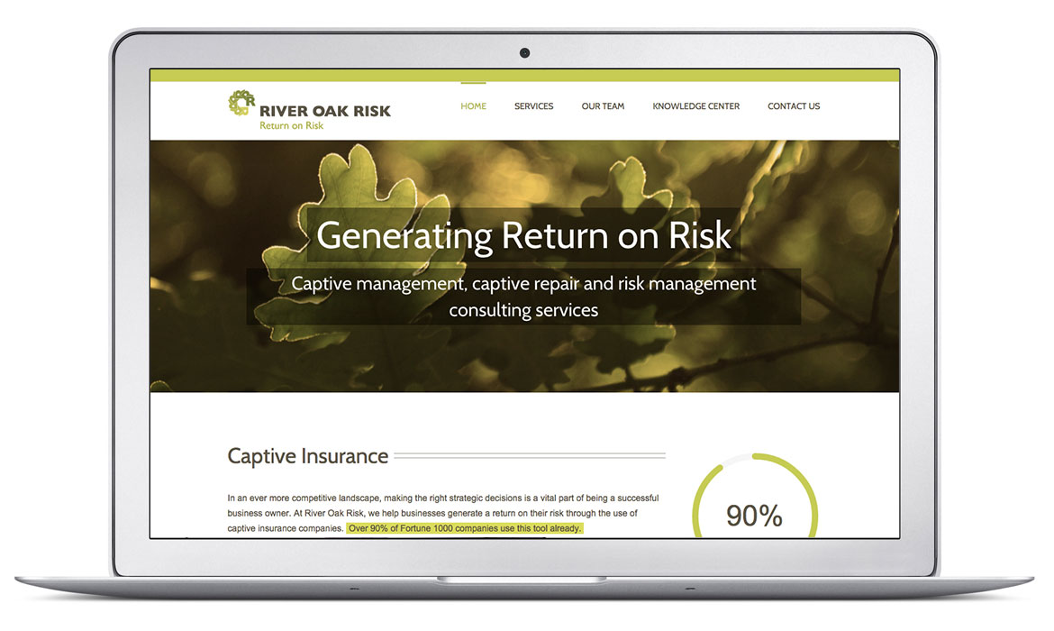

Project Description
This captive insurance business was new and didn’t even have a name when we met. When they did land on a name, it was a fun opportunity to get in a room with the founders to brainstorm what the brand needed to represent. Captive Insurance is basically when a business owner pays premiums to itself to insure itself. It is a way for businesses to maximize their investment as they keep any premiums that don’t pay out. That is the concept for the logo. The R in the logo mark returns and intensifies in color – a visual analogy of the core of their product offering.
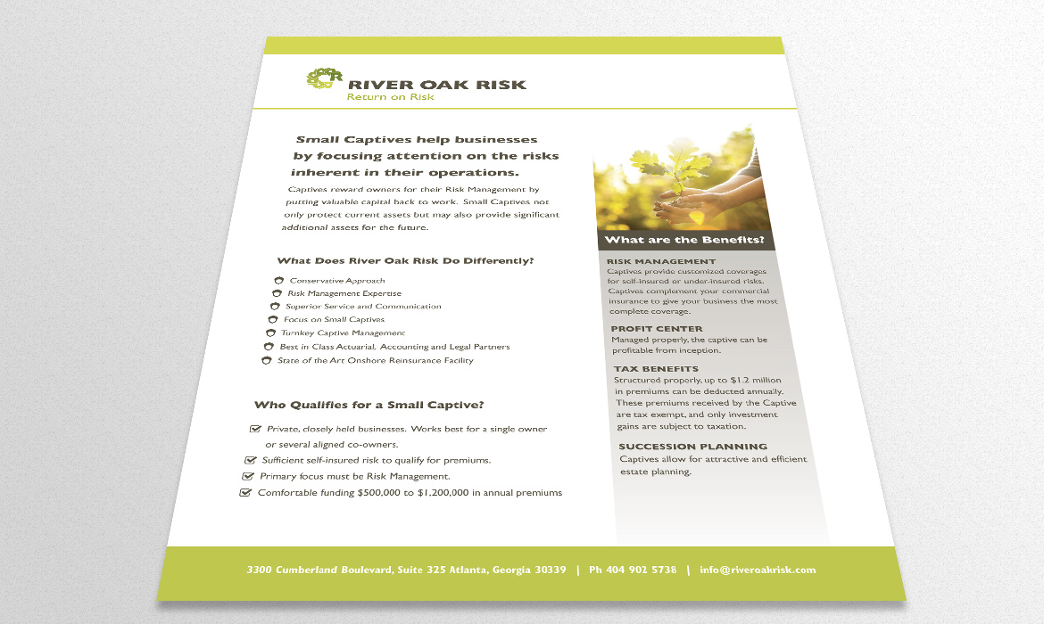
Since their business is not about volume but rather high-quality, high-dollar individual clients I suggested their business card needed to embody stability and feel expensive. I designed a letterpress business card with a custom illustrated oak backdrop pattern. The card is duplexed to give it heft and weight.